Note: This entire article is tool agnostic. That is, it doesn’t matter if you use Sketch, Figma, Adobe XD, or Microsoft Paint, these tips will help you.
 If you haven’t already, I highly recommend starting out with Part 1 of this guide, which establishes a proper foundation of design best practices and will ensure your journey begins on the right foot.
Part 2 of our series helps you dial in your productivity potential by teaching you how to make your tools work for you instead of against you.
Before we start, click here to check out my design system for Figma!
5. Extend the capabilities of your design tool
Tools like Sketch, Figma, and Photoshop are absolute powerhouses of functionality, but every tool has its limits, so don’t stop where the features end.
There are millions of gifted users in the world, and lots of them have built utilities known as add-ons, plugins, or extensions for doing all kinds of new and wacky things beyond the base functionality of the tool.
Think of your design tool like a video camera. Here’s a fancy one that production teams in Hollywood like to use:
The body of a camera provides its core functionality: recording and storing footage. But most cameras come equipped with slots, plugs, threads, and clamps for adding all kinds of tools: lenses, monitors, microphones, etc:
These additional tools allow me to do things faster and better than I could with the base tool itself: Footage is sharper, audio sounds cleaner, and batteries last longer.
Extending the capabilities of your design tool will save you time and allow you to do things that would be extremely difficult with the base tool alone.
Sketch, for instance, has accumulated a substantial ecosystem of plugins from the developer community. These plugins allow designers to supplement their workflow with resources like external data, translation services, and accessibility testing. On its own, Sketch doesn’t provide these types of features, but plugins make them possible.
Don’t forget to optimize your workflow with ancillary tools, too. These are accessory utilities for performing specific tasks really, really well — tasks like renaming layers, generating charts, or simulating color-blindness.
There are all kinds of menu bar apps, browser extensions, and utilities that can improve your workflow. Here are some of my favorites:
- For Sketch: Runner Pro, Connection Arrows, Anima Toolkit, Chart Full, Artboard Manager, Symbol Organizer, Rename It, Stark, Kopie
- For Chrome: WhatFont, Dimensions, Window Resizer, Design Grid Overlay
- Mac Apps: Nucleo Icons, The Noun Project, SkyFonts, BetterTouchTool
Note: I’d be remiss to not address the potential dangers of plugins and add-ons. Plugins and add-ons are kind of like using aftermarket parts on your car. You’ll probably be fine, but they’re not made by the original vehicle manufacturer, so you run the risk of them breaking and wreaking all kinds of havoc.
I strongly recommend familiarizing yourself with the development team(s) of your favorite plugins and add-ons. If a tool is maintained by a single person, I’d caution you against making it central to your workflow, particularly if the tool is free. You never know when they might stop maintaining it, much to the detriment of your work.
- Why it made me better: Extensions give me superpowers, helping me work 4x faster than before. My design tool feels like an extension of my brain instead of a barrier to progress. Using extensions has completely changed my mindset about product functionality, and I recommend extensions and add-ons as product and business opportunities to clients all the time.
- Further reading: Adobe XD: Plugins 2018 by Abhishek SM, 11 Must Have Sketch Plugins to Improve Your Design Workflow by Jason Chan, and Supercharge Illustrator With VectorScribe and VectorFirstAid by Scott Lewis
6. Build your own reusable tools
I spent the first year at my agency serving clients in all kinds of different industries, dreaming up solutions to a multitude of design problems.
After we conducted the appropriate amount of research and discovery, each project started at square one: setting up my file, creating styles, and assembling the usual collection of elements and components, like buttons, fields, checkboxes, dropdowns, date pickers, etc.

Initially, I enjoyed the exploratory, creative freedom. It was an opportunity to start fresh and build things from scratch.
But redesigning the same stuff over and over again started to drive me crazy. I became obsessed with finding a better way to start new projects. I found great inspiration in Bootstrap, the first mainstream frontend UI framework for helping developers build websites and apps faster.
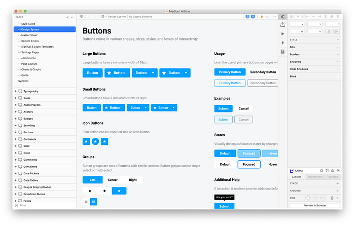
Inspired by Bootstrap’s streamlined out-of-the-box experience, I decided to build my own boilerplate template for designing apps. I examined past projects to identify the common elements in each design, then built a file template with these pieces already constructed.
Here’s a peek at my Sketch template file:


Since all of these elements and components are already designed, it frees up time to explore and experiment with visual style, micro-interactions, layout, and ultimately, the design solution itself.
A chef shouldn’t ever have to spend time chopping carrots and onions during dinner service, so that’s all done ahead of time. This is no different.
Recognize when you’re repeating a process over and over, then figure out a way to “templatize” it, either on your own, with other resources, or by using extensions.
- Why it made me better: By building templates, I forced myself to perfect and optimize the construction of repeatable elements so that in real-world usage scenarios, they were flexible, scalable, and maintainable. I have grown more as a designer building reusable tools than through any other technique in this guide.
- Further reading: UX Power Tools by Jon and Christian, Everything you need to know about Design Systems by Audrey Hacq, Sketch App Sources by Galya Iliev and Todor Iliev
7. Stop reinventing common design patterns
This one is hard to fight when you’re a new designer. It’s tempting to want to “make a splash” and stand out. Every element in your design feels ripe for innovation and reinvention — convention and protocol be damned.
There is a time and place for reinvention, but the beginning of your career is not that time. Arguably, you can have a successful and fruitful career without ever pushing the envelope, so long as you continue solving problems.

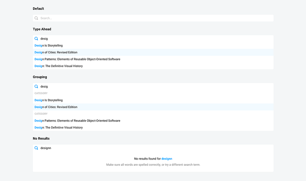
Case in point: As much as I’d love to fundamentally change the micro-interaction of type-ahead searching, it’s simply not worth my time. Perhaps there is a better way to design type-ahead search — maybe it’s faster, more predictive, or accurate — but unless it’s a central feature of the product (ahem, Google), then I’ll focus instead on the bigger, more important design challenges.
Conventions and established patterns exist because they’re reused habitually and with much success. Changing or challenging the way something is done simply to be different isn’t a reason for reinvention. You’re creating extra work for yourself and wasting time that would be better spent on a larger design challenge or augmenting the product/business in some other way.
Furthermore, using common design patterns establishes trust and reliability with your stakeholders. They’ll notice that you consistently deliver thoughtful and effective solutions and feel more confident about returning to you with future projects.
- Why it made me better: My mental fatigue decreased. Instead of trying to invent 25 unique solutions for every little interaction on a page, I could focus on the bigger picture of the user experience as a whole.
- Further reading: Netflix design patterns and flows by Kari Meric, Great UI Design Inspiration Websites and Why You’ll Find Them Useful by Tricia
8. Find auxiliary design resources
If I used a stopwatch to time where I spend my energy assembling a design, I can say with pretty high confidence that most of it goes toward ruminating over fake usernames, searching for placeholder avatars, and authoring dummy data.
To be honest, I actually kind of love inventing these fake stories. I bought a typewriter last year and it makes me feel like Ernest Hemingway, so let’s just blame it on my hipster tendencies. But you shouldn’t have to spend your time this way.
The crux of every design is the content or data itself, so it’s important to be thoughtful and intentional with the copy from the beginning. Without data, your design cannot, and will not, tell a story. “Lorem ipsum” is meaningless, but your design shouldn’t be. Stakeholders will have a much more difficult time deriving value and following a workflow if the data is nonsense, so it’s worth your time to communicate the functionality of your design through the data or content you put into it.
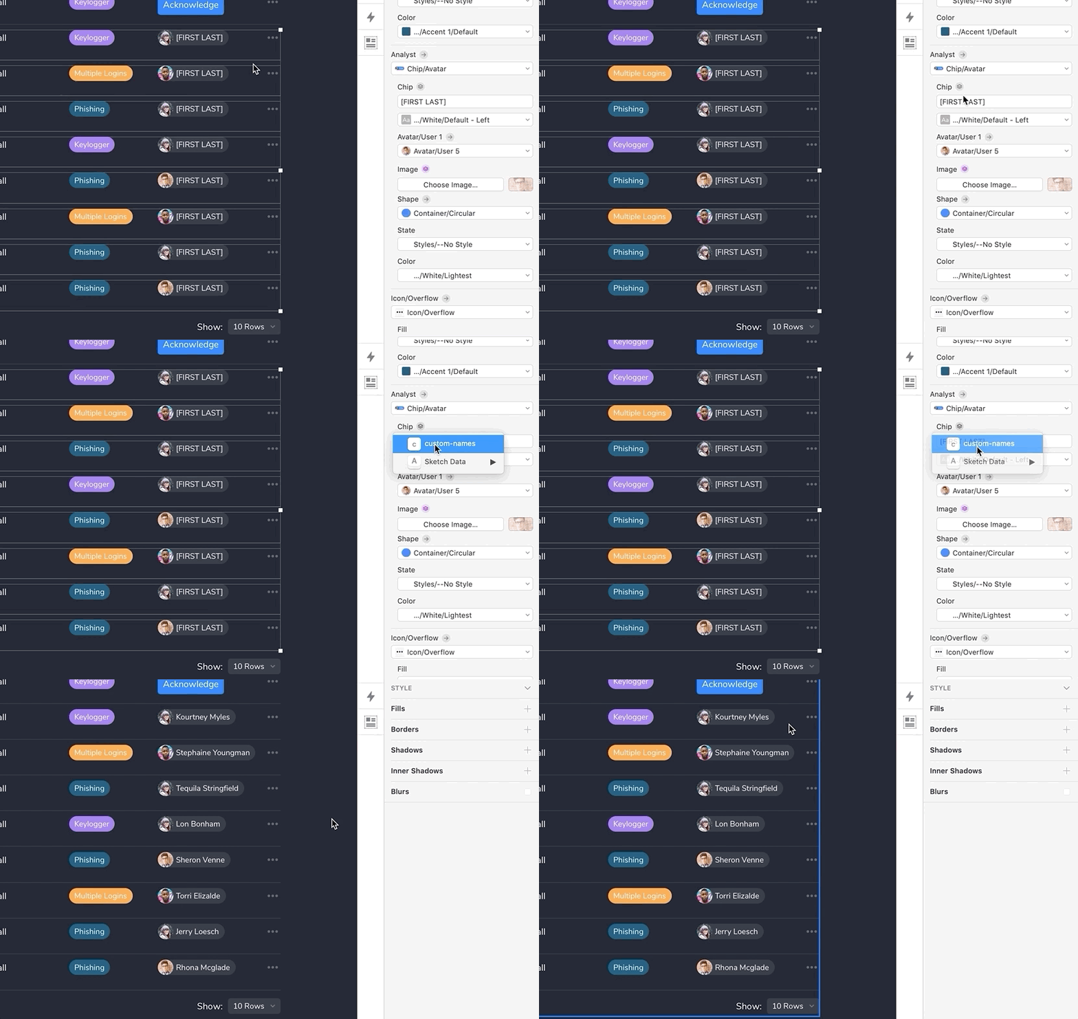
So yeah, that all sounds like a great idea, but data tables like this one are particularly time-consuming to design because of data volume and disparity:

Instead of typing every row by hand, I’ll use auxiliary design resources to help me generate realistic dummy data. Every IP address, name, and category in the image above was auto-generated using external data sources, which saved me a considerable amount of time.
Sketch has a built-in data populator that lets you source dummy data from a plain-text file. You can find random data lists online (my favorite is Populate), or create your own from scratch:


With realistic dummy data in hand, I can now use my design tool (or a third-party plugin/add-on) to populate my design. Here’s how it works in Sketch:


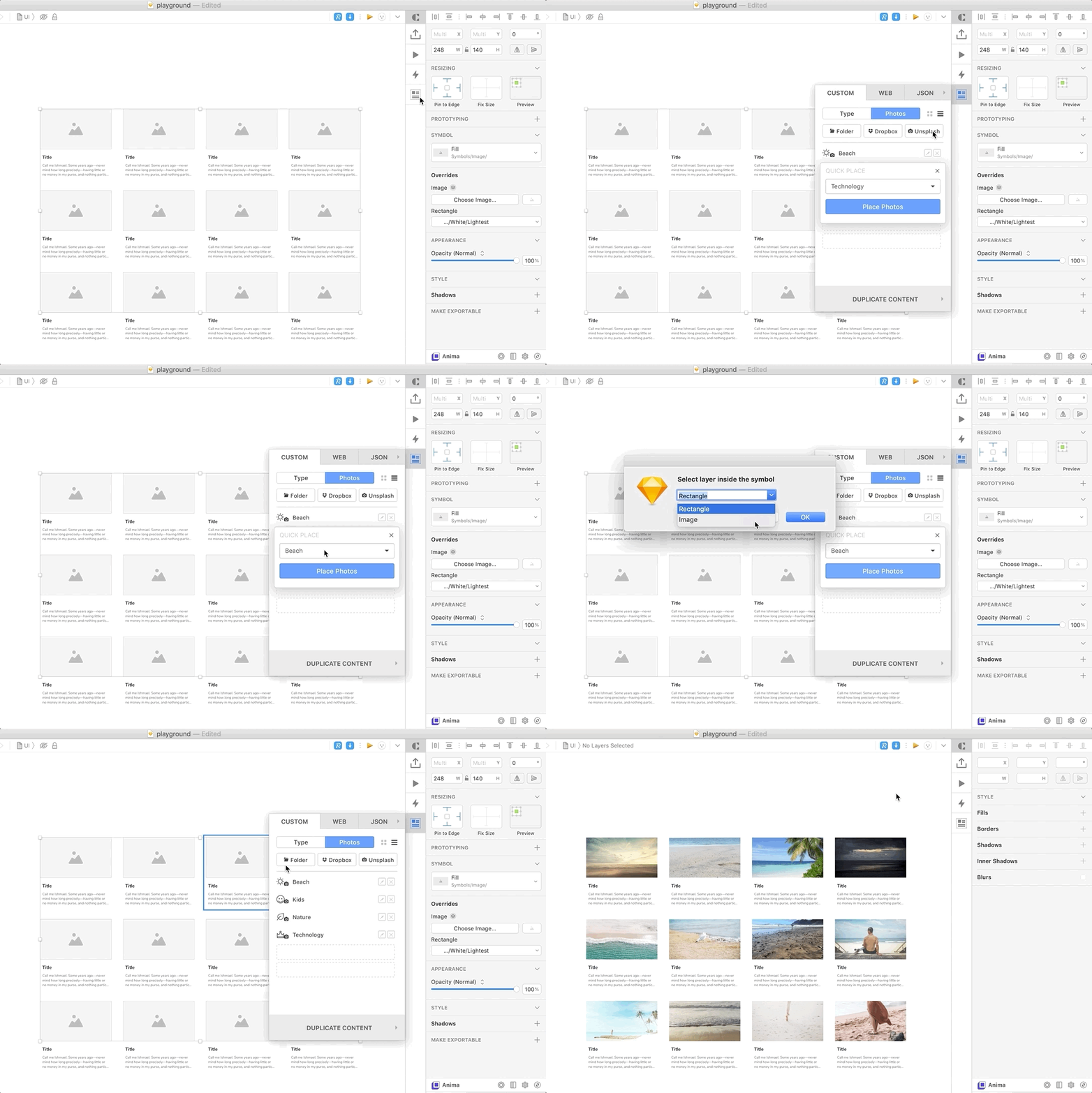
You can find collections of images too, and pull them directly from the web using tools like Craft from InVision:

- Why it made me better: Designs feel closer to reality since the data isn’t repeated, complete nonsense, or irrelevant. This also makes reviews with key stakeholders much more productive because, quite simply, the design is easier to follow. Furthermore, it’s imperative to test with real data so you properly prepare your design for issues like overflow and truncation.
- Further reading: How to Use Lists.design by Lists.design, Seed Your Salesforce Org with Mock Data by Andy Schmiechen, Modern Design Tools: Using Real Data by Josh Puckett, Datum Ipsum: Designing real-time visualizations with realistic placeholder data by Matthew Ström
Summary
Tool enhancements like add-ons, plugins, and external resources will help you work smarter, not harder. Used effectively, you’ll accomplish more, faster, without increased effort.
While designing more isn’t necessarily a goal, efficiency gains on the execution side of design will enable you to spend more effort (or even take more risks) elsewhere in the design process. This could mean more time for research, more time refining a workflow, or more time innovating.
Your design tool should be nothing more than a means to an end… it’s simply an instrument for visualizing the ideas in your head.
We’ll finish this series in Part 3 by discussing more “cerebral” growth opportunities that will help you make better design decisions before you ever put pixel to screen.
9. Design less.
10. Write more.
11. Emphasize outcomes.
12. Work collaboratively.
Read it here:
When I’m not writing about design, I’m the lead designer at Innovatemap, a digital product agency in Indianapolis, Indiana, USA.
Some other stuff:

