Member-only story
How I Fixed Gmail’s UX and Saved My Sanity
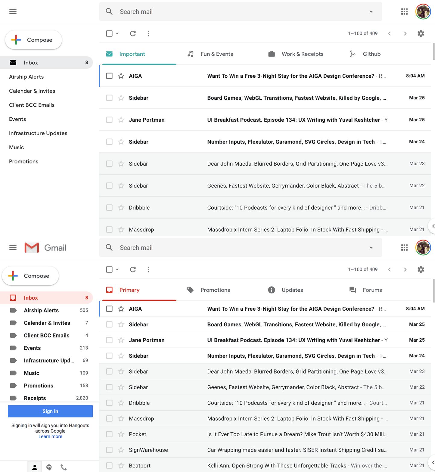
I miss Inbox, so I hacked Gmail with a little CSS magic

 “Oh my God. If I cannot change this interface, I’m going to go insane,” was all I could think when I opened up Gmail for the first time in years and faced the transition from Inbox to Gmail. Any other die-hard Inbox fans feel the same?
When Google announced that Inbox would be killed, I was devastated. I procrastinated and avoided the switch back to Gmail, savoring every last moment with Inbox. Every few weeks I logged in to Gmail, clicked around, immediately felt overwhelmed, then promptly closed my browser. Then Inbox started to threaten doom and gloom with a big, bold alert message.

So I blocked off a few downtime hours each week to deal with it.
For the most mileage possible, this takes work. You could apply my CSS Stylesheet for the same UI skin, though the real fix involves implementing your own set of filters and tags that make sense for you. It’s a combination of:
- Using the tools in Gmail that do work, such as filters, settings, and tab structure.
- Personal restraint in using tags and colors minimally. Not everything needs to be screaming so loud with a tag or signifier of importance.
- This Inbox-inspired CSS Stylesheet that I created to bring back some of the simplicity from Inbox. It can be applied with the Google Chrome Extension User CSS, or any similar extension.
If you want to add in the CSS in the order I explain it, first install the User CSS Extension into Chrome, then copy and paste the CSS snippets throughout this post into your extension window with Gmail open.
Warning: The CSS shown here only works with this particular build of Gmail. When Gmail updates/recompiles their code, all of the CSS here will likely break. Still, I really think it’s worth it for the days/weeks that this will actually be working.

