Member-only story

 I’m often asked “Meirav, what does biophysics have to do with user experience?” Well, being a multidisciplinary person provides me with an endless pool of ideas, perspectives, and metaphors that I greatly enjoy using in my work as a designer. Borrowing the concept of friction from physics to describe a notion in digital product UX is a great example of connecting the two worlds.
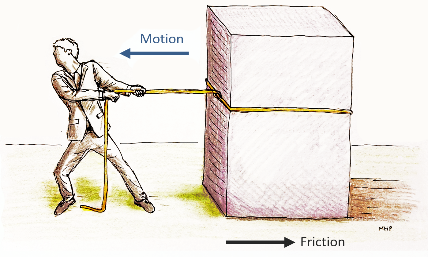
In mechanics, friction is a force that resists the relative motion of two objects sliding against each other. But friction is at work in the digital world as well.
Friction in UX acts between the user and a product: While a user tries to complete a task, the force of friction acts in the opposite direction, backward. As a result, our user’s progress is slower, and he has to use greater effort to move forward and complete the task.
Steve Krug’s book Don’t Make Me Think (a must read for any UX designer) outlines the principles of good usability. Krug’s notion is that users should be able to accomplish their tasks as easily and directly as possible.
For users, “don’t make me think” means we shouldn’t need an instruction manual to operate the UI. It also means making the least number of decisions and using the least cognitive effort possible. We prefer to burn calories in the gym.
For UX designers, “don’t make me think” means incorporating known patterns into our designs, using common UX standards, applying consistency, and creating a solid, intrinsic system logic to make users establish habits. It also means decreasing visual load, creating good information hierarchy, etc.
But as a UX lead and researcher who has been working closely with users and customers for many years, I’ve realized that when it comes to complex systems that control critical functionality, the fast, easy, and standard way of doing things is not always the best for users.
When there is limited friction, everything goes smoothly—maybe too smoothly.

