Member-only story
Long Live Lobster
We make fun of Lobster for being overused, but is popularity such a bad thing?

 Several years ago now, I was editing a newspaper feature that required me to find a snazzy font that would scream, from afar, “COCKTAILS.” It was to be a regular feature reviewing the newest, fanciest watering holes, and it didn’t take me long on the DaFont Top 100 before I found Lobster. It was perfect: retro but not classical, fun but not silly, smooth but not loopy. It became our signature cocktails font.
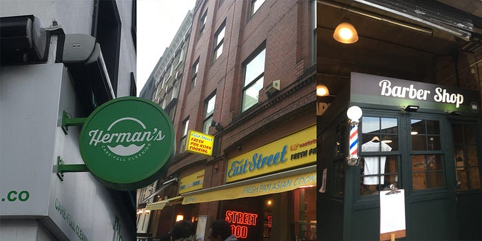
Fast-forward a bit and a strange thing started happening. Lobster started following me. It began to inhabit my dreams and haunt my waking moments. I couldn’t turn a street in London without seeing it looming over me.
This had happened to me before, of course. It was the late ’00s and the font was Bleeding Cowboys — possibly the most horrendous typeface committed to the internet — which I had used on my Harry Potter website (yes, I was a child). And then, suddenly, it was everywhere, befouling adverts and shop awnings and flyers for club nights. Occasionally still, I see it out in the wild and I get flashbacks to another time, another font…
 I shouldn’t have been surprised by the ubiquity of Lobster. It had been, after all, on lists of the most popular fonts almost 10 years ago, where lazy designers go to find the most inoffensive, crowd-pleasing fonts (fonts that Martin Scorsese might call “theme park” fonts). It has 4.6 million downloads on DaFont alone. That popularity might partly be due to the fact that it’s a public domain font, meaning even the most cheapskate clients might plump for it. Pablo Impallari, an Argentinian designer and the font’s progenitor, let it out into the world back in 2010 and then walked away. His website might be 404ed but his work lives on around the world. And the more I found that Lobster was stalking me, the more determined I was to snap back.

I started photographing instances of the font in the wild. Sometimes it was the original Lobster font; at other times it was facsimiles that evoked the spirit of Lobster. Individual glyphs might differ slightly, but the…

