Member-only story
How to Make Boarding Passes More Traveler-Friendly
This important slip of paper could be doing so much more to make your hellish travel day better

 As someone who has travelled to 108 countries and territories so far, flying 35 to 40 airlines from six continents, I’ve had the chance to study airline boarding passes at some length. Being a travel and design aficionado, I go so far as to keep all my boarding passes, classifying them by various criteria and comparing the designs among airlines.
In my opinion, too few airlines pay attention to the design of their boarding pass. Lately, even the branding colors and the logo have disappeared from some ticket designs. Below is an example from Malaysia Airlines (until recently one of only a few five-star airlines in the world, according to Skytrax ratings) and another from United Airlines (sold as a flight codeshare via All Nippon Airlines, a five-star airline).

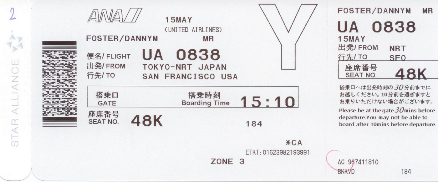
As one can easily notice, not much consideration is given to the hierarchy of information or the grouping of similar elements. In fact, the data seems haphazardly printed on both these tickets.
With examples like these, it’s honestly pretty easy to create something significantly better, as even a modicum of attention to detail would generate an improved experience.
Ready?
First, let’s look at the prototype below. I divided the boarding pass into three equal sections, framed by two bands of equal size at each end (note that one of the bands is tearable).

Now, let’s ask ourselves what are the three most important things to know about your flight when you are at the airport, right after you’ve checked in. Based on my research, these are:

