Member-only story
What I Learned About Design from Travel in Japan
Small improvements and thoughtful details lead to highly efficient and accessible cities

 While traveling in Tokyo and Osaka in December 2016, I came across a few little instances of design that struck me as being particularly well thought out. These well-designed experiences might seem simple and easy to miss or take for granted, but they pack tremendous design intelligence that we can learn from.
“Everything is designed. Few things are designed well.”
— Brian Reed
1. How to make cash payment as fast as cashless payment

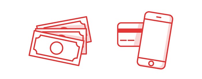
With Apple Pay and Android Pay heralding the new age of mobile payment, cash-based payment seems all but obsolete. After all, it takes so much time for the cashier to count your notes, open the cash register, and prepare your change. Swiping your credit card or tapping your smartphone is just much faster.
Unless you’re in Japan, that is.
I was shocked when I saw the sheer speed of automated cash register machines in Japanese supermarkets. With these machines, the cashier simply has to insert the bills into the machine’s slot, and before you can finish saying “cashless payment,” your change is calculated and spat out.
See it in action here:
(Note: In the video, the customer used a large bill to pay for his groceries, so the machine took a longer time to prepare a stack of bill for his change. In my own experience, the whole process took seconds.)
Japan’s automagical cash register machines are not only incredibly fast, they also help eliminate human error.
This is, of course, a testament to the brilliant engineering prowess of the Japanese. Japanese engineering — and its focus on…

